PTTEP
Time To Celebrate
Celebrating 4 decades of innovation, PTTEP engages in petroleum exploration, development, and production, as well as renewable energy and advanced technology in more than 10 countries across several regions. Committed to a sustainable future, PTTEP prioritizes reducing carbon emissions to contribute to a low-carbon world for everyone.

BACKGROUND
For Special Occasion.
A logo is a crucial element in defining a brand's identity. It effectively communicates the company's name, corporate identity colors, and embodies significant brand values. Recognizing the pivotal role of the logo, meticulous design is paramount. This includes the development of a style guide that provides clear instructions for its proper usage, particularly in special instances such as PTTEP's 40th Anniversary.
Service
Experiences
Completion date
2024
Logo
Showcasing The Identity.
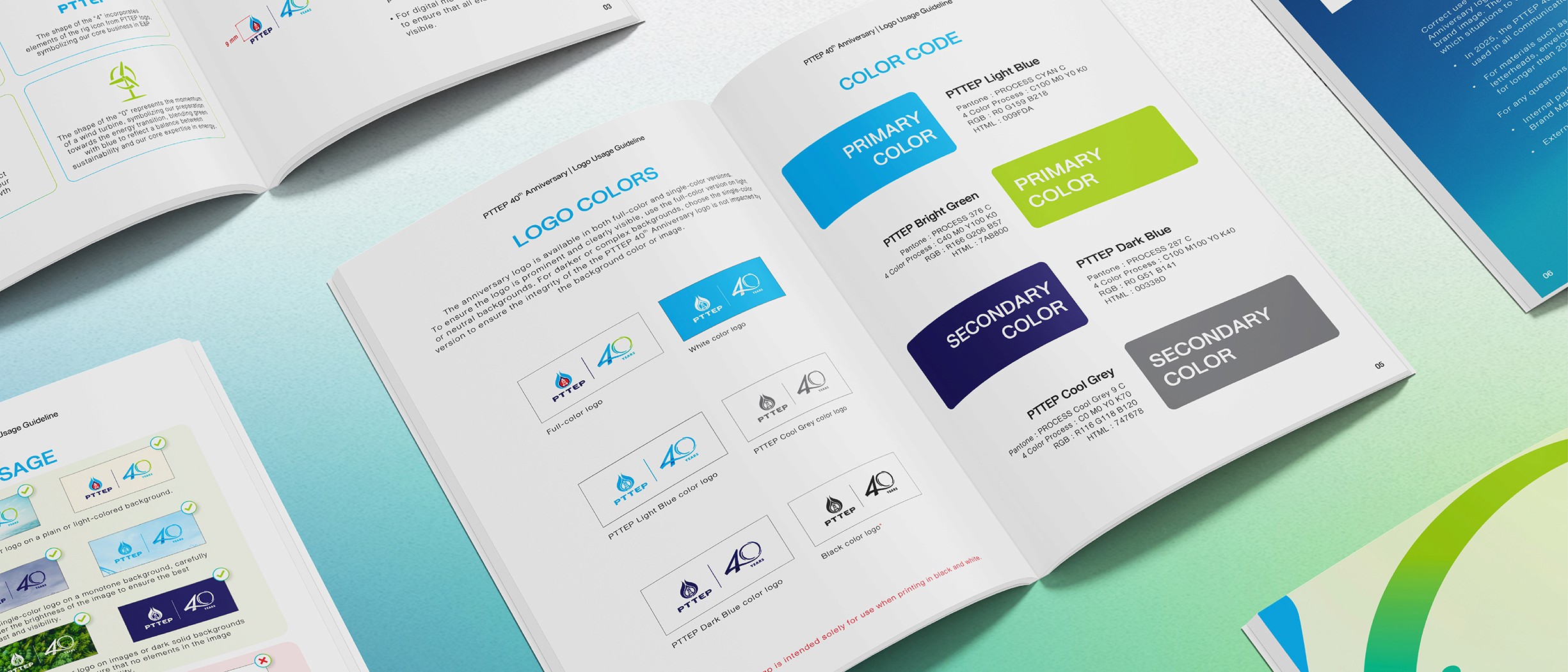
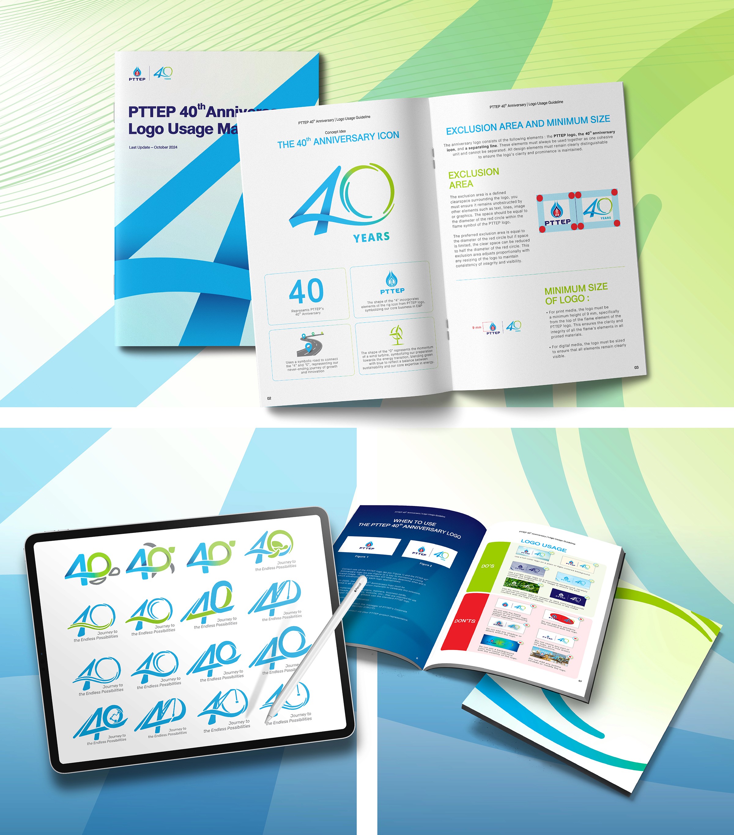
We design logo with sharp precision and meticulously with each detail. Our graphic team pick out the significant elements from the service PTTEP have provide from the past 40 years along with discuss with client to provide the best logo design ever.
Motion Graphic
Process of Becoming.
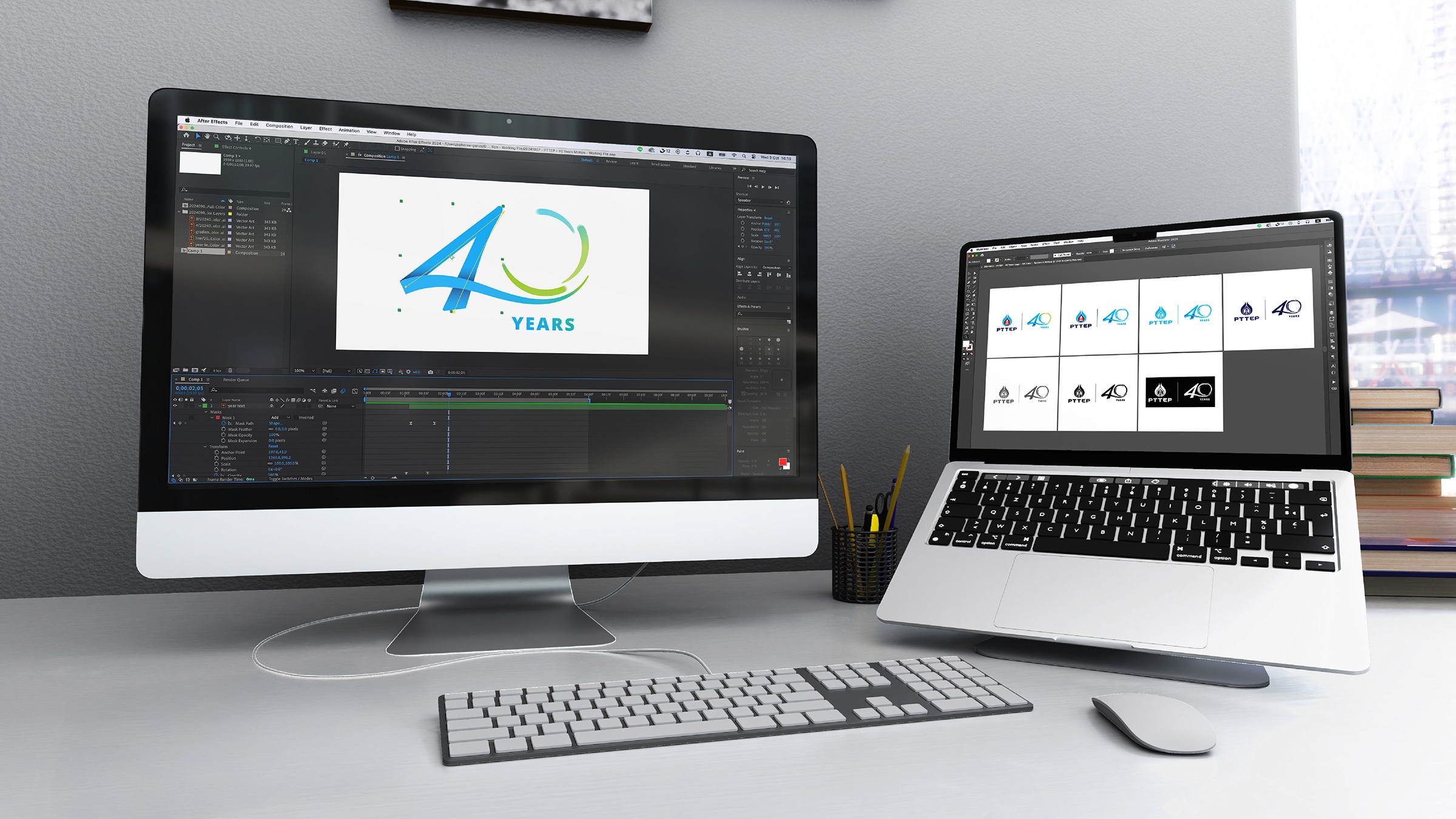
The 40th-anniversary logo motion graphic aims to visually depict the creative process, showcasing the journey from initial drafting to the final colored artwork. The motion begins with dark blue, the brand's primary color, to prominently emphasize its core identity.
To ensure proper usage, this guide provides detailed instructions and guidelines for all instances where the company logo is used. By adhering to the manual, the company presents a professional and trustworthy image since the consistent application of the logo enhances brand recognition and strengthens its overall impact.
behind the scene
Made From Scratch.
The logo development process begins with thorough research. We investigate the key elements to include, carefully consider the logo's intended purpose and the desired brand message to effectively communicate the company's identity during this significant 40th-anniversary milestone.
Results
The Real Uniqueness.
This logo uniquely expressed PTTEP's distinct identity from every perspective and encapsulates the essence of its business endeavors over the past 4 decades. Every instance of the logo usage will serve as a reminder of the company's significant milestones and its unwavering commitment to environmental sustainability, both today and in the future.

BACKGROUND
For Special Occasion.
A logo is a crucial element in defining a brand's identity. It effectively communicates the company's name, corporate identity colors, and embodies significant brand values. Recognizing the pivotal role of the logo, meticulous design is paramount. This includes the development of a style guide that provides clear instructions for its proper usage, particularly in special instances such as PTTEP's 40th Anniversary.
Service
Experiences
Completion date
2024

Logo
Showcasing The Identity.
We design logo with sharp precision and meticulously with each detail. Our graphic team pick out the significant elements from the service PTTEP have provide from the past 40 years along with discuss with client to provide the best logo design ever.

Motion Graphic
Process of Becoming.
The 40th-anniversary logo motion graphic aims to visually depict the creative process, showcasing the journey from initial drafting to the final colored artwork. The motion begins with dark blue, the brand's primary color, to prominently emphasize its core identity.
To ensure proper usage, this guide provides detailed instructions and guidelines for all instances where the company logo is used. By adhering to the manual, the company presents a professional and trustworthy image since the consistent application of the logo enhances brand recognition and strengthens its overall impact.
behind the scene
Made From Scratch.
The logo development process begins with thorough research. We investigate the key elements to include, carefully consider the logo's intended purpose and the desired brand message to effectively communicate the company's identity during this significant 40th-anniversary milestone.
Results
The Real Uniqueness.
This logo uniquely expressed PTTEP's distinct identity from every perspective and encapsulates the essence of its business endeavors over the past 4 decades. Every instance of the logo usage will serve as a reminder of the company's significant milestones and its unwavering commitment to environmental sustainability, both today and in the future.


BACKGROUND
For Special Occasion.
A logo is a crucial element in defining a brand's identity. It effectively communicates the company's name, corporate identity colors, and embodies significant brand values. Recognizing the pivotal role of the logo, meticulous design is paramount. This includes the development of a style guide that provides clear instructions for its proper usage, particularly in special instances such as PTTEP's 40th Anniversary.
Service
Experiences
Completion date
2024

Logo
Showcasing The Identity.
We design logo with sharp precision and meticulously with each detail. Our graphic team pick out the significant elements from the service PTTEP have provide from the past 40 years along with discuss with client to provide the best logo design ever.

Motion Graphic
Process of Becoming.
The 40th-anniversary logo motion graphic aims to visually depict the creative process, showcasing the journey from initial drafting to the final colored artwork. The motion begins with dark blue, the brand's primary color, to prominently emphasize its core identity.
To ensure proper usage, this guide provides detailed instructions and guidelines for all instances where the company logo is used. By adhering to the manual, the company presents a professional and trustworthy image since the consistent application of the logo enhances brand recognition and strengthens its overall impact.
behind the scene
Made From Scratch.
The logo development process begins with thorough research. We investigate the key elements to include, carefully consider the logo's intended purpose and the desired brand message to effectively communicate the company's identity during this significant 40th-anniversary milestone.
Results
The Real Uniqueness.
This logo uniquely expressed PTTEP's distinct identity from every perspective and encapsulates the essence of its business endeavors over the past 4 decades. Every instance of the logo usage will serve as a reminder of the company's significant milestones and its unwavering commitment to environmental sustainability, both today and in the future.


BACKGROUND
For Special Occasion.
A logo is a crucial element in defining a brand's identity. It effectively communicates the company's name, corporate identity colors, and embodies significant brand values. Recognizing the pivotal role of the logo, meticulous design is paramount. This includes the development of a style guide that provides clear instructions for its proper usage, particularly in special instances such as PTTEP's 40th Anniversary.
Service
Experiences
Completion date
2024

Logo
Showcasing The Identity.
We design logo with sharp precision and meticulously with each detail. Our graphic team pick out the significant elements from the service PTTEP have provide from the past 40 years along with discuss with client to provide the best logo design ever.

Motion Graphic
Process of Becoming.
The 40th-anniversary logo motion graphic aims to visually depict the creative process, showcasing the journey from initial drafting to the final colored artwork. The motion begins with dark blue, the brand's primary color, to prominently emphasize its core identity.
To ensure proper usage, this guide provides detailed instructions and guidelines for all instances where the company logo is used. By adhering to the manual, the company presents a professional and trustworthy image since the consistent application of the logo enhances brand recognition and strengthens its overall impact.
behind the scene
Made From Scratch.
The logo development process begins with thorough research. We investigate the key elements to include, carefully consider the logo's intended purpose and the desired brand message to effectively communicate the company's identity during this significant 40th-anniversary milestone.
Results
The Real Uniqueness.
This logo uniquely expressed PTTEP's distinct identity from every perspective and encapsulates the essence of its business endeavors over the past 4 decades. Every instance of the logo usage will serve as a reminder of the company's significant milestones and its unwavering commitment to environmental sustainability, both today and in the future.

An Advertising Agency & Production House for Brands That Strive Forward.
OFFICE
New Business
Nathsasi (Rin)

An Advertising Agency & Production House for Brands That Strive Forward.
OFFICE
New Business
Nathsasi (Rin)

An Advertising Agency & Production House for Brands That Strive Forward.
OFFICE
New Business
Nathsasi (Rin)

An Advertising Agency & Production House for Brands That Strive Forward.
OFFICE
New Business
Nathsasi (Rin)


