
If your website is not mobile-friendly yet, then it is a big mistake. You are missing out big time on your potential customers.
According to Hootsuite Digital 2023: Thailand report, the total number of internet users in Thailand is 61.21 Million, while the mobile connections in Thailand at the start of 2023 is 101.2 million. The number of mobile connections in Thailand increased by 5.4 million (+5.6 percent) between 2022 and 2023, making it increasingly important in generating leads and making sales.
Mobile is the future of search engine marketing, but many websites still perform poorly on mobile. This is where Mobile Optimization comes in to make your website mobile-friendly.
What Is Mobile Optimization?
Mobile Search Engine Optimization, alias Mobile SEO, is customizing your website to ensure that mobile and tablet users have the best experience accessing the website on their device. This process helps you improve organic traffic, which is traffic coming to your site from search results pages (SERPs). Mobile-friendly optimization also includes making your site resources accessible to search engine crawlers.
Mobile Search Engine Optimization is customizing your website to ensure that mobile and tablet users have the best experience accessing the website on their device.
Mobile experience factor has quite an impact on your ranking after Google's move to mobile-first indexing and the Mobilegeddon Update. So the priority for web developers has shifted to making the site mobile-friendly FIRST. (See more Google ranking factors in our 'What is SEO?' article.)
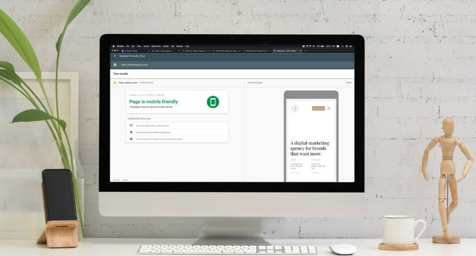
Also note that a 'mobile' device only includes smartphones, as Google puts tablets “in their own class” and states: “when we speak of mobile devices, we generally do not include tablets in the definition”. Still, the main idea here is to optimize your site for ANY device.If you're not sure if your website is optimized well enough for mobile users, the easiest place to get started is the 'Mobile-friendly Test' by Google.
So, what is there to consider to improve your mobile-friendliness?
Mobile User Experience
One area that’s crucial to optimize is user experience. If you do not get this right, people won’t stick around long enough to read your content. A great place to start making improvements is the bounce rate.
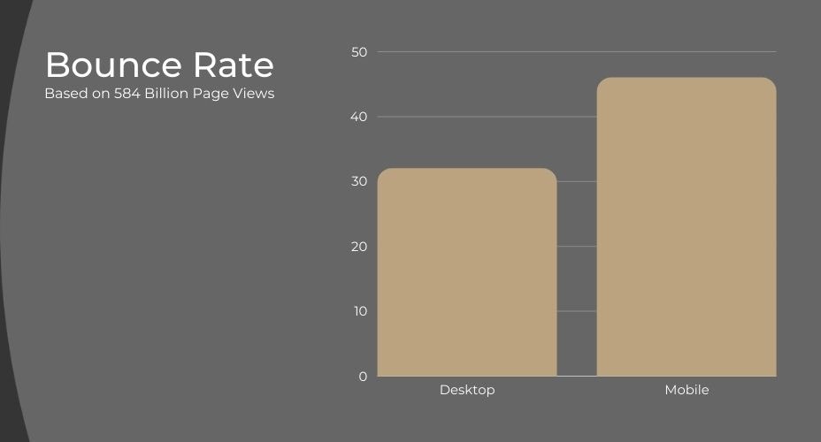
Bounce Rate
Since dwell time (the time visitors stay on the page after following a link to your site) is a major SEO ranking factor, the more people bounce, the worse it is for your mobile-friendly search ranking. One of the reasons for bounce rate is page speed.
Page Speed
According to Google, 53% of visits are abandoned if sites take more than 3 seconds to load. Besides, half of your visitors expect pages to load in 1-2 seconds. See how important it is? A good starting point is to use Google’s mobile speed test to see if there are any speed issues on your site.
Page speed is even more important for mobile users than desktop or laptop because of hardware and connectivity issues unique to mobile. Try optimizing image sizes, simplify code, leverage browser caching, and reduce redirects.
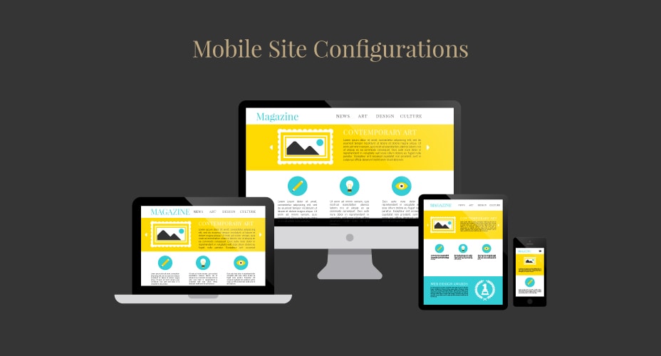
Mobile Site Configuration
To succeed with mobile-friendly SEO today, your site needs to work well on mobile devices. Don't just serve mobile visitors with a mini version of the desktop site. There are 3 different ways to configure your site for mobile. Each has its pros and cons.
Separate URL (aka. the "m." configuration)
You have a different version of your website with a different URL, mostly starts with "m.", to redirect mobile users to it. It was popular back in the day. Now it's a huge deal to manage as it's prone to content duplication risk and lots of redirects reducing the page load speed.
Dynamic Serving
You keep the site on the same URL, but show each user different HTML/CSS version depending on the device they use.
Dynamic serving is obviously better than having separate URLs, but they pose some disadvantages as well. They often accidentally show the desktop version to mobile visitor. You also need to constantly create different versions of your content for new devices that come out. If you don’t, your site might show a version that looks terrible on that device. So we also don't recommend this method.
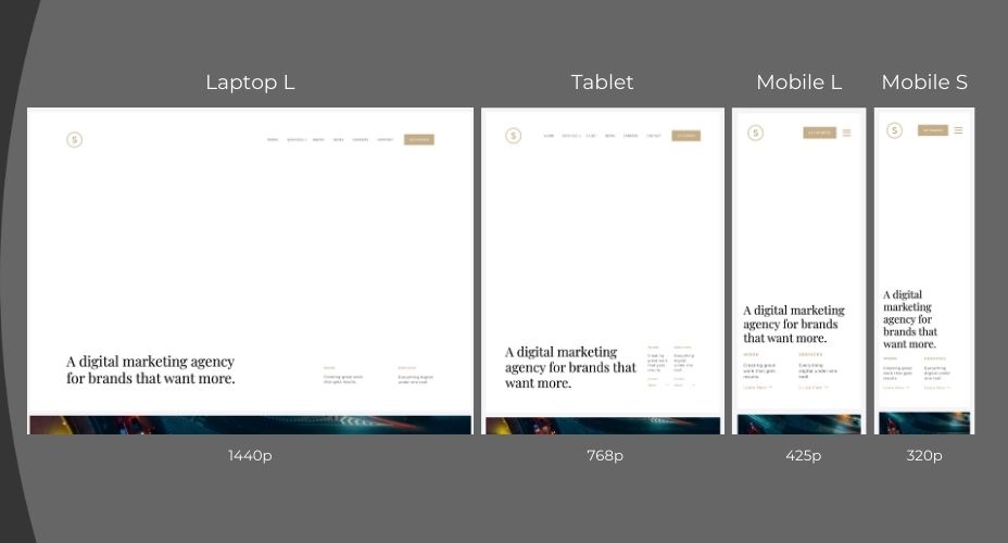
Responsive Web Design
This is by far the best configuration for Mobile SEO in 2023. Your page resizes to fit each screen individually without having separate URLs or different HTML for each device.
Google prefers responsive design above all the rest.
Responsive design ticks all boxes for an optimal mobile experience. No SEO headaches like “rel=canonical tags”, duplicate content issues etc. And no redirects, as we said would cause technical SEO issues and can slow down your site.
Google prefers responsive design above all the rest. If you’re running a WordPress website like us, making it responsive can be as simple as installing the right theme. If not, ask your web developer to implement Google’s guidelines for responsive web design.
Mobile Web Design Best Practices
Don't block CSS, JavaScript, or Images. In the old days, some devices could not support all of these elements, so web developers blocked them on mobile. But for the most part, it's no longer true, and the Smartphone GoogleBot wants to be able to see and categorize the same content that users do. So don't hide it. These elements are also critical to helping Google understand if you have a responsive site or a different mobile solution.
Don't use flash. Flash Player may not be available on your user's device. If you want to create special effects, use HTML5 instead.
Don't use pop-ups either. It can be difficult and frustrating to try and close those pesky pop-ups on a mobile device. This might lead to a high bounce rate.
Design for the fat finger. Touch screen navigation can lead to accidental clicks if your buttons are too big, too small, or in the path of a finger that's trying to get the page to scroll.
Other Factors to Consider
Optimize titles and meta descriptions
Remember that you're working with less screen space for mobile SEO. To stand out in SERPS, be as concise as possible when creating titles, URLs, and meta descriptions. And try your best not to lose the quality of the information.
Optimize for local search
If your business has a local element, remember to optimize your mobile content for local SEO. This includes standardizing your name, address, and phone number and including your city name in your site's metadata.
Frequently Asked Questions
Is mobile SEO different from desktop SEO?
Most desktop SEO focuses on the general public without focusing on geographic location, while mobile SEO typically focuses on local search. That is because most people look for local results when searching on their mobile phones. When a user searches on their mobile device, Google is aware of where they are.
Does mobile optimization affect SEO?
Mobile SEO affects voice search. The increase in voice searches mirrors the rise of mobile search. With voice search on home assistant devices like Amazon's Echo, people will be able to find content from anywhere, even if they don't have a phone.
Why is mobile SEO so important?
Mobile-friendly optimization ensures a quality mobile user experience. To that end, site design, page speed and more are taken into consideration.
What are dedicated mobile websites?
A mobile-dedicated site is designed specifically for mobile phones. They usually are distinct from the whole site and live under a separate URL.
Why does my website look different on mobile?
If you see a miniature version of your website on your phone, it's probably because a mobile version of the site does not exist. When it's impossible to find a mobile version, your device looks at the whole thing as a desktop computer would and shrinks it to fit your screen.
Does SEO Cost money?
It is technically free. You don't pay money for placement on the internet search engine results page. Content is ranked based on the E-A-T: Expertise, Authority, and Trust. Google ranks the resources that they think are valuable to the user.
Need Help Optimizing Your Mobile Site?
Does your brand need help with Mobile SEO? Our team at Sphere Agency is here to help you optimize your website for the highest ranking on Google. Check out our SEO Services and Web Design & Development for more information. Getting interested? Contact us today.